

GamerBraves Newsletter vol. 83 - How The Gen 1 Pokemon Designs Made A Great First Impression


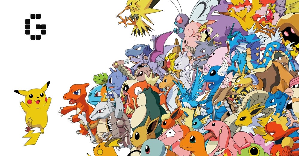
Pokemon Day has passed, celebrating the many different monsters that the series has introduced us to in the last 27 years. I have favorite pokemon from across the different generations but today, I couldn’t help but think back to the first Generation of Pokemon.
Gen 1’s become almost controversial in the last few years, between the ‘Genwunners’ who think it’s the only good gen, to people fiercely proclaiming it to be overrated, with a number of bad designs and being overall “too simple”.
For me, however, Gen 1 has some of the most interesting designs in the series that would pave the way for future lines of Pocket Monsters. So today let’s take a quick look back at Gen 1 and what made this set of pocket monsters so iconic for years to come.
The Simplicity of Gen 1

So let’s start by addressing the Gen 1 is “too simple” argument. A lot of the pokemon in Gen 1 are seen as just being regular animals, Pidgey is just a bird, Rattata is just a rat, Krabby is just a crab, and its Japanese name is literally “Crab”.
My response to this is that being simple doesn’t necessarily mean bad. Having simple designs meant they stood out more on a tiny black-and-white Gameboy screen, and in some ways, I think the first batch of Pokemon became so iconic because they’re based on very straightforward concepts that are executed in interesting ways.
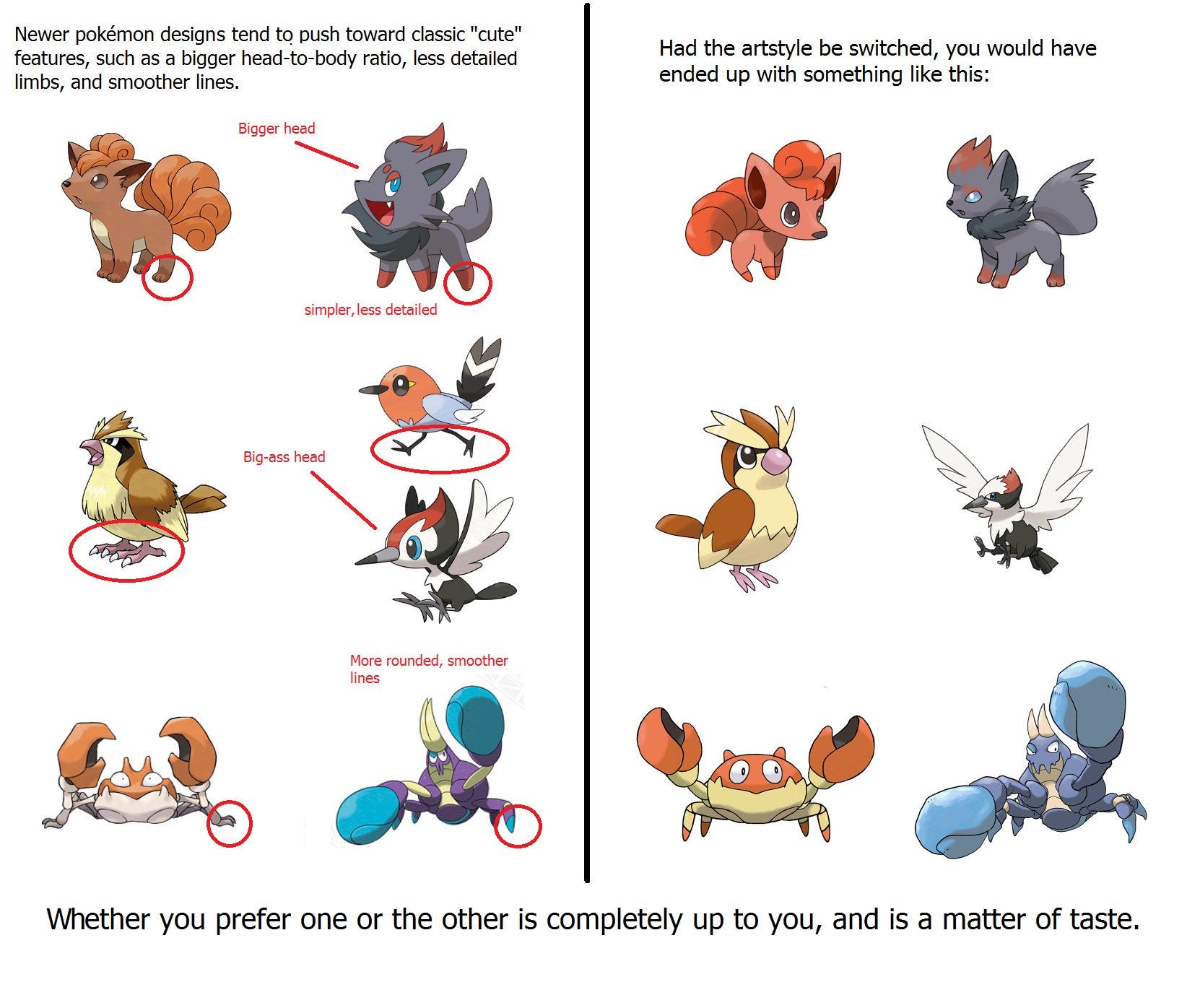
As the artist, VivinkArt points out, a lot of modern Pokemon tend to be drawn in a cuter cartoonish style. Furthermore, they have more distinct personalities and are very specific with what they’re supposed to be, whether that’s a corgi, an aye-aye, or a Kamen Rider.
In Gen 1 however, there was a much more grounded yet also bluntly abstract approach to design, taking a more basic idea of what the creature is and twisting their most notable features to make them feel otherworldly. A good example is Gen 5’s Zoroa and Gen 1’s Vulpix. They’re both based on the Japanese fox Yokai however Zoroa is more humanized with an emphasis on its mischievous personality while Vulpix seems more like an actual fox accentuated with six tails based on the myth.
Gen 1’s Pokemon Kingdom
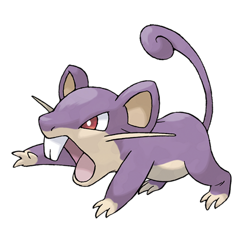
A good example of simple done right is Rattata. It’s easy to write off Rattata as just a rat but I remember as a kid, it was pretty intimidating to see Rattata on Route 1. All of the art depicting it made it look angry. Its eyes were sharp, its mouth wide open and it had those sharp teeth jutting out. I knew I didn’t want to get bitten by this thing, and that combined with its purple fur and curled tail was enough to make it feel like more than just a regular rat (and Raticate was even worse).
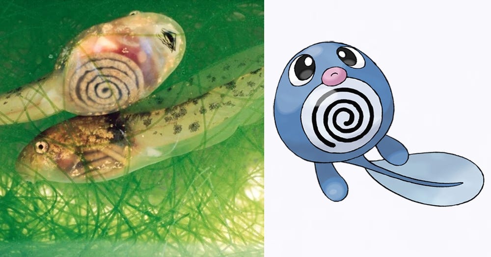
They can even take from some of the more obscure aspects of these animals. For example, the Pollywag line is known for its distinct spiral patterns but this actually comes from the fact that tadpoles actually have transparent stomachs that show their intestines. This small detail become one of the most memorable parts of Pollywag’s design.
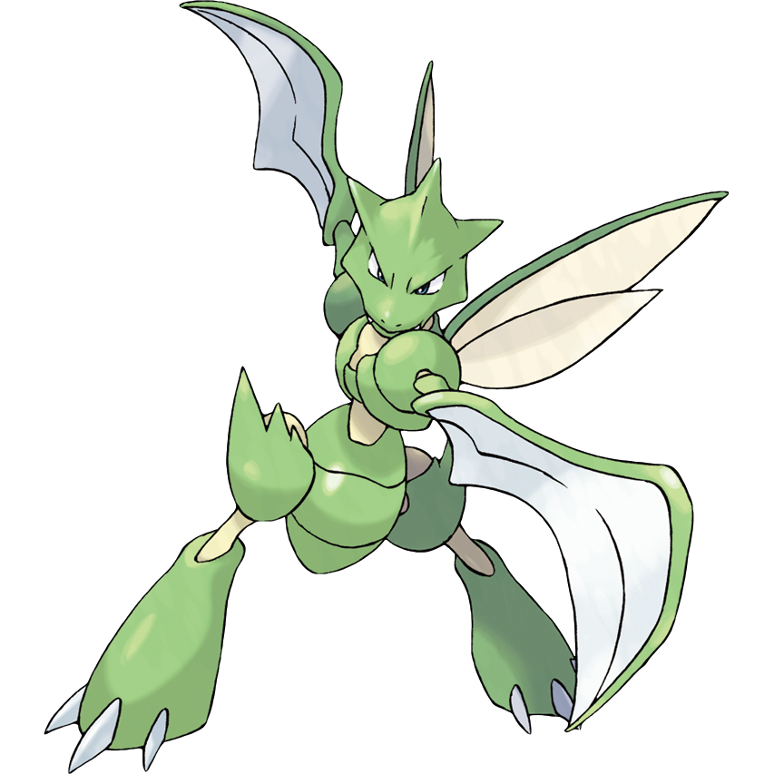
This process of abstraction can be seen in the more out-there Pokemon of Gen 1. Let’s take for example my favorite pokemon Scyther. Scyther is a bug with a velociraptor head and actual blades for arms. It seems like a strange mismatch of ideas until you think about its inspiration as a Mantis. These are insects that ambush their prey by ensnaring them in their sharp forearms and eating them alive. Scyther’s design conveys the deadly arms and the fearsome ambush attacks by making it a sword-wielding raptor. It’s this method to the madness that made Pokemon so loveable.
The Strange Experiments
The other factor about Gen 1 is that despite how straightforward the designs might be if you think about it, a lot of them are fairly weird even by Pokemon standards. There’s a very ‘throw things at the wall and see what sticks’ mentality to the pokemon in Gen 1. You can almost see the designers themselves trying to figure out what a pokemon should be with the different concepts for each Mon.
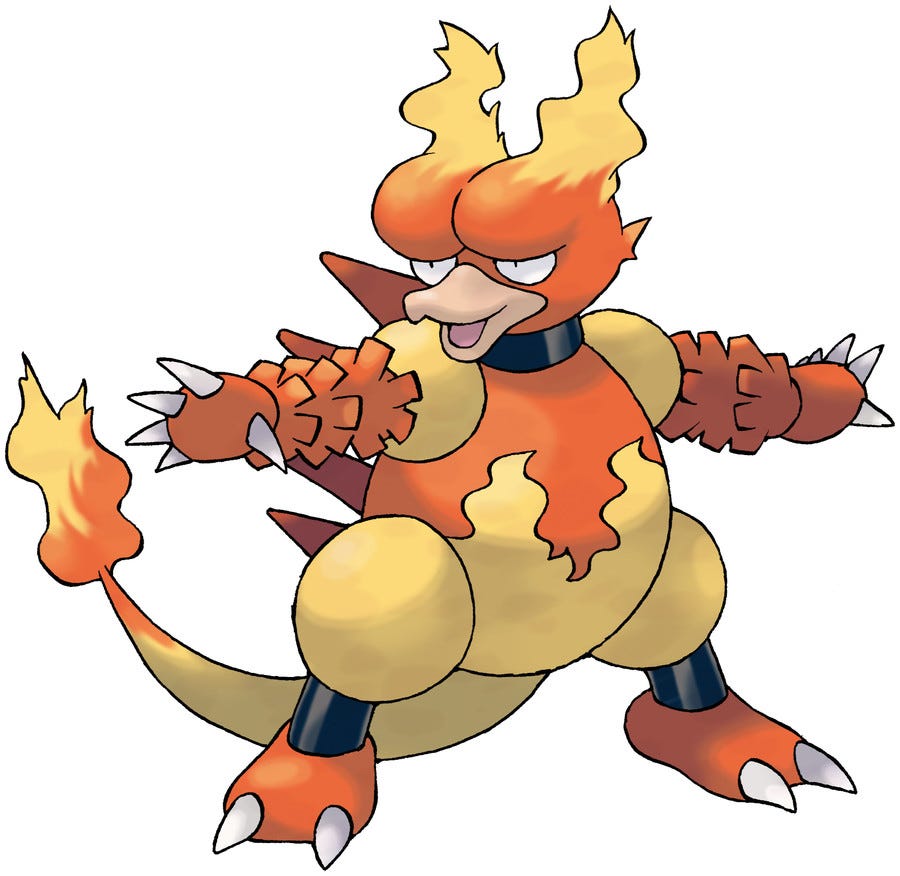
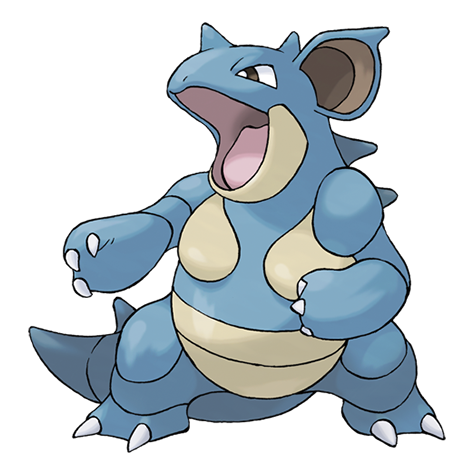
Magmar is a bird with a reptilian body covered in fire, Venusaur is a prehistoric dino-frog with a rafflesia on its back, there are essentially five pokemon here that can best be described as “pink ball” and to this day, I don’t really know what the Nidoran line is supposed to be. They’re like poisonous rabbits that turn into poisonous rhino dinosaurs?
If you haven’t noticed, a lot of early Pokemon also seem to incorporate kaiju-esque dinosaur designs. We’ve mentioned the Nidos, Venusaur, and Magmar but even the kangaroo and rhino pokemon look as if they came out of a Godzilla movie. Sometimes I wonder if Mewtwo wasn’t the only pokemon Kanto frankensteined together in a lab.
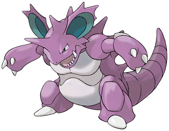
Even this however comes back to the idea of abstraction but here, it’s less about the animals and more about the concept they’re meant to depict. The point of Nidoking and Nidoqueen is that they represent sexual dimorphism in animals, what creatures they are doesn’t matter beyond that. Likewise, Pokemon like Snorlax and Slowbro may both be bears of some sort but they’re really made to capture the idea of a creature that’s lazy or slow-witted.
Each design is made so the player can instantly tell what this pokemon is about regardless of how strange they are. More importantly, however, it also showed that anything could be a Pokemon. There is no animal, myth, object, or even subculture, that could not be turned into a pokemon in some form.
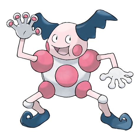
It’s for this very reason that I’ll admit, I even really like the humanoid Gen 1 pokemon like Mr. Mime, Jinx, Machamp, Hitmonchan, and Hitmonlee because you can see the same process. It’s a kickboxer, so no head and long segmented legs, it’s a mime so large hands and rounded fingertips to show it making invisible walls. It’s fascinating to see this kind of missing link between the real-world professions and the more cartoonish take on humanoid monsters we’d see later with Gardevoir or Gothitelle.
Closing Thoughts
Yes, a lot of the ideas in Gen 1 do appear and are arguably improved upon in later pokemon generations. More recent Pokemon like Galvantula or Noivern arguably still fit these same design processes. With that said, I can’t help but appreciate Gen 1’s monsters for being so straightforward while also having such an “anything goes” style of creativity.
With a lot of recent pokemon, you can read whole essays on their inspiration, whether they be from nature, cultural practices, or myths. This makes it interesting to go back to the more simple style of Gen 1. A style that essentially said, “the Pokemon is about vines, they going to be nothing but vines and red sneakers.” It’s not rocket science to put a couple of animals together but it’s a creative kind of simplicity, one that sparks the imagination and created a good showcase of everything a Pokemon could be.
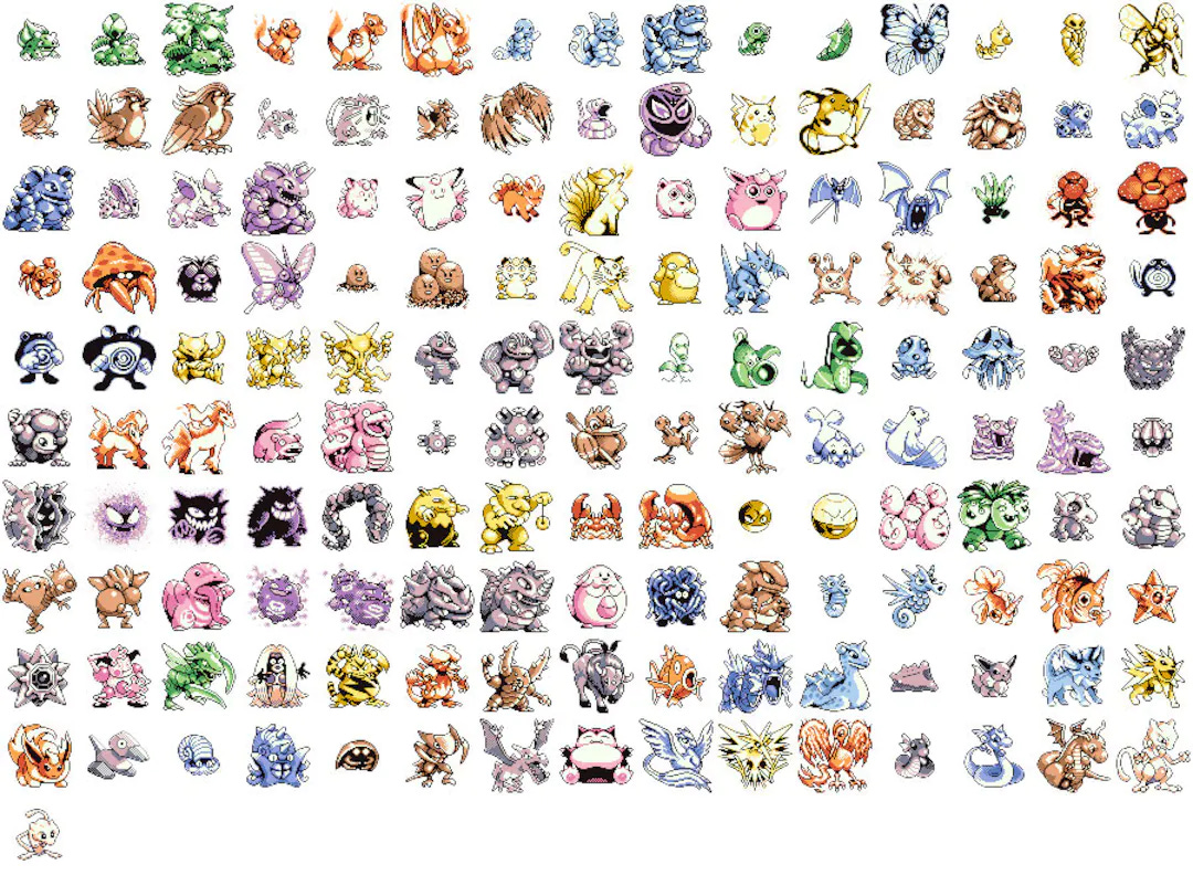
Tough, cute, ugly, and creepy, the original 151 Pokemon had something for everyone. They also served as the perfect building block for later gens of creatures. I doubt that the complex designs of Gen 4’s cosmic gods or Gen 7’s sand castle ghosts could reinvent the wheel quite as well if these guys didn’t lay out the original blueprints.
Feature written by Alex Daud Briggs

UT Has No Limits
Two sets of DLC coming out later this year
Pokemon fans Unite in Kuala Lumpur


Congratulations on reading this far! You now have a chance to win a code for the recently released Company of Heroes 3 for PC.
By simply reading this article, you have already been entered into the giveaway.
If you’re the lucky winner, we’ll email you the results. Simply reply back within 72 hours telling us what you thought of this newsletter, we’re always looking for more feedback on how to improve. After that, we’ll send you the code.
How did you find this issue of The GamerBraves Newsletter? Leave your comments below or let us know your feedback privately.
Want more GamerBraves content? Simply follow these links: